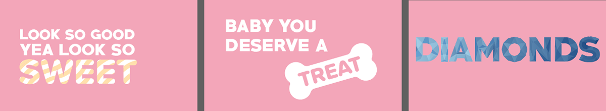
Kinetic Typography: BLACK PINK - Ice Cream
Objective
The goal of this project was to create an kinetic typography video as an accompaniment to a song of our choice. I chose the song Ice Cream by BLACKPINK as I thought that the lyrics of the song are very visual.
Rationale
The use of a flat pop art style paired with psychedelic imagery and pastel colours is the perfect combination for this summery song. The pastel colours are reminiscent of the Los Angeles beach aesthetic. The font that I used for this project is _____ which is the same font used in the BLACKPINK logo. This font has a heavy bold weight and is perfectly suited for the energetic playful vibe of the song.
Process
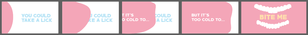
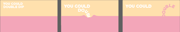
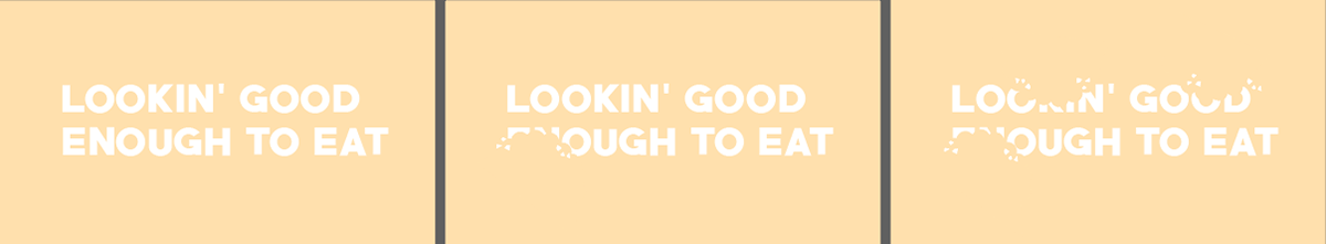
This project was pretty much my introductory foray into motion graphics and the After Effects, as such the process I went through to create this piece was largely just me learning how to use the program. Having said that, I was very happy with some of the design solutions that I happened upon for certain phrases in the song. I was particularly happy with how refreshing the treatment for the line “Ima make it better” was and I was quite chuffed with how the animation for the word “diamonds” turned out. It was extremely satisfying coming up with my own effects by experimenting with the program and this project really sparked my love for motion graphics.