Overview
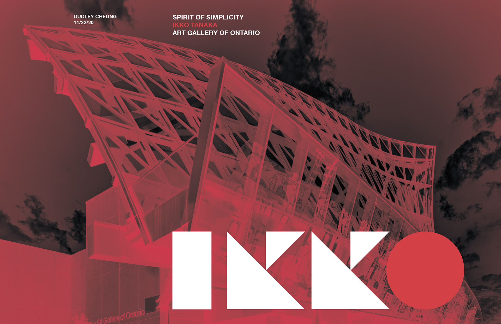
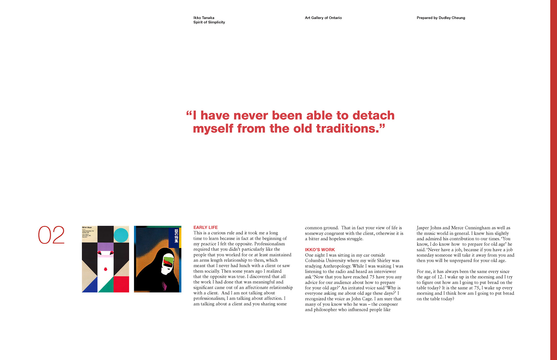
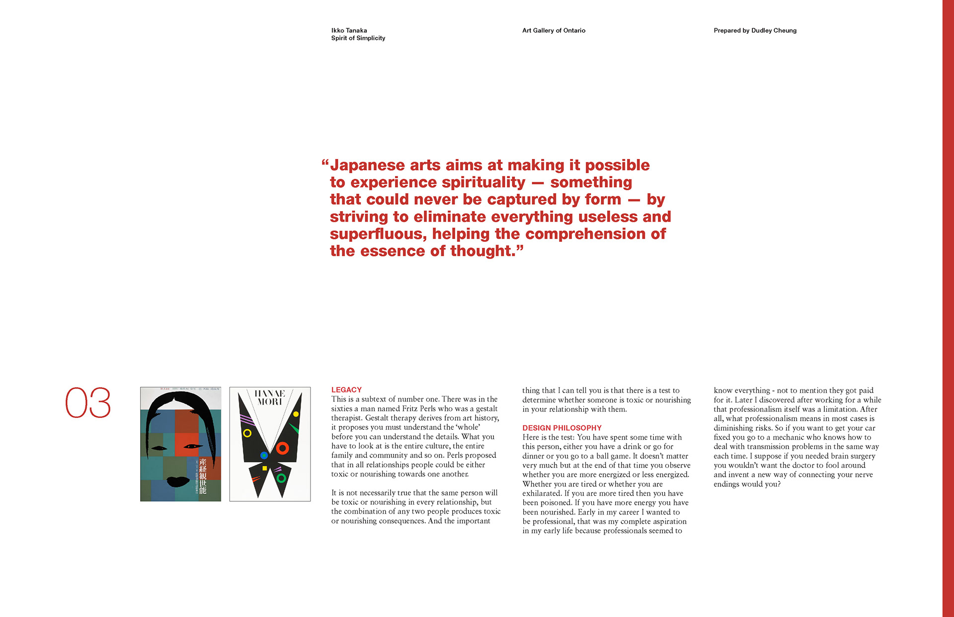
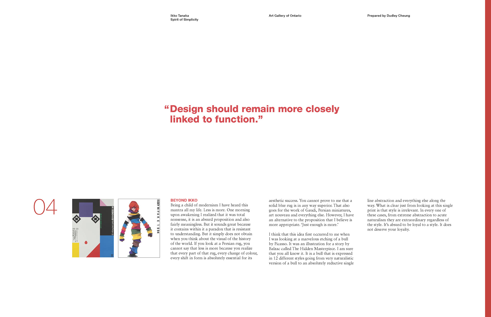
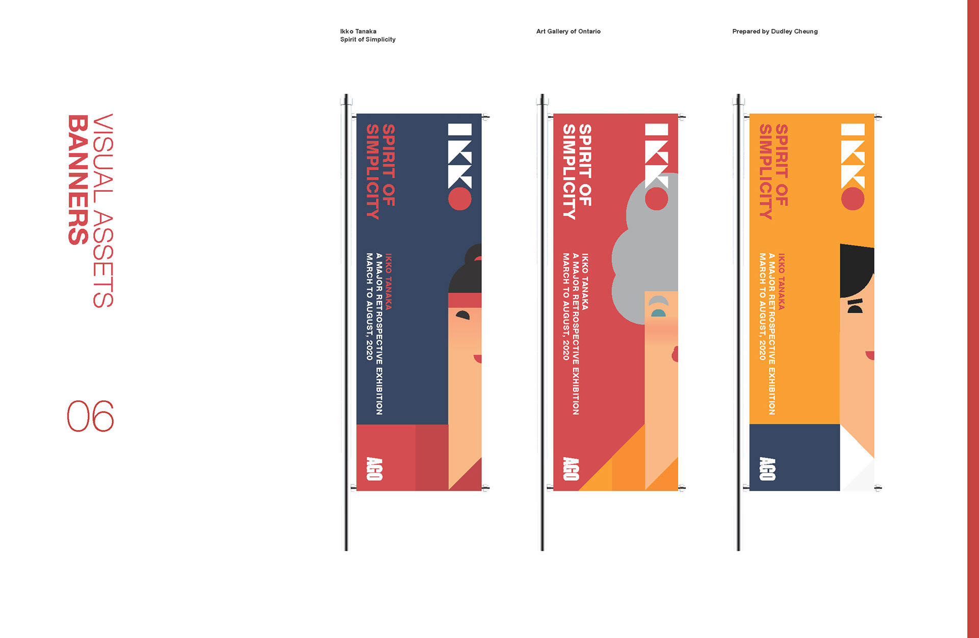
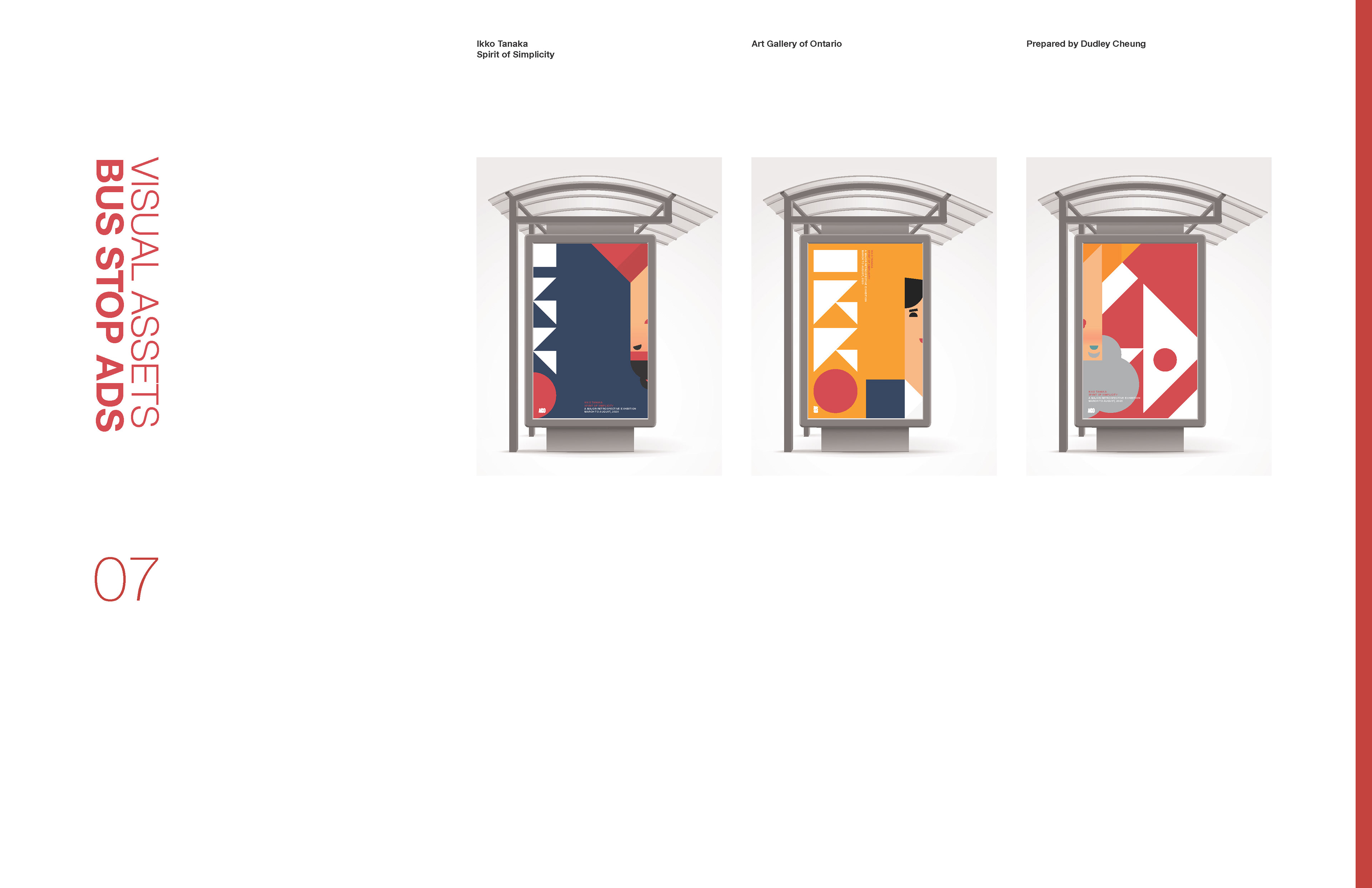
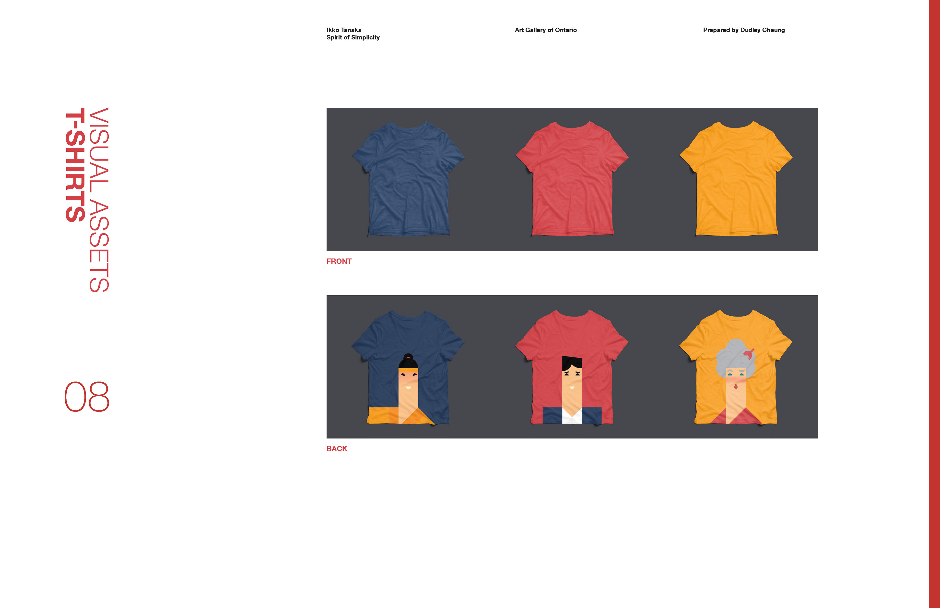
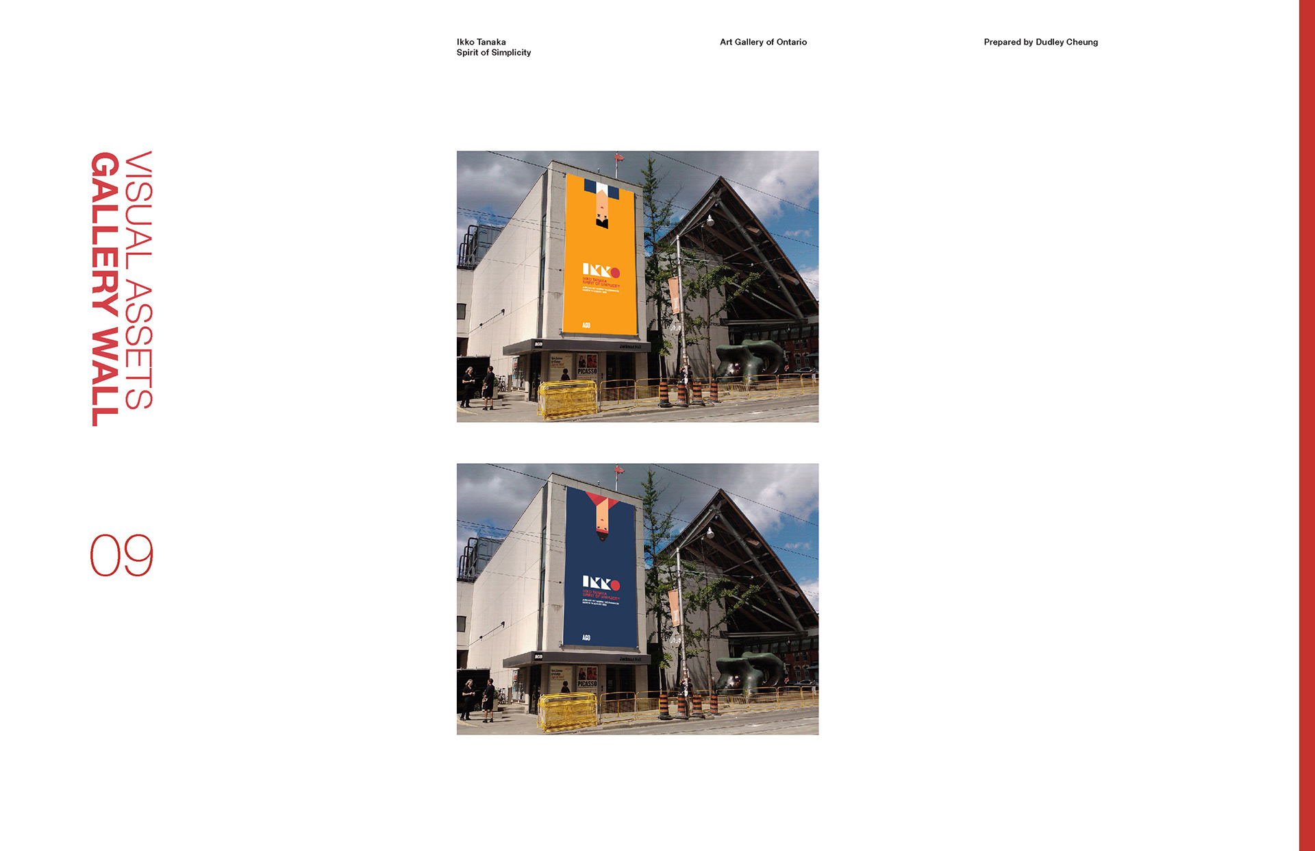
This was another assignment in my typography class in which we were to develop a branding system for a fictional exhibition on a famous designer of our choice. The deliverables for this assignment included a booklet to go with the exhibition as well as merchandise, posters and bus stop advertisements.
My Role
Design, Typography, Illustration
Process
Ikko Tanaka was a designer from Japan that was known for his mastery of the concept of simplicity. His designs featured expressive illustrations created using only simple geometric shapes. With this in mind, I decided to only use simple geometric shapes in the construction of the promotional material for the exhibition. I also used this approach in designing the main logo for the exhibit. The name Ikko is formed using only squares, triangles and circles and the circle in his name was accented red like in the national flag of Japan.
