Overview
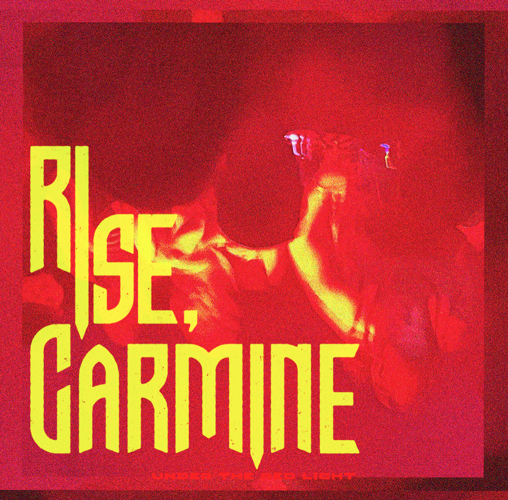
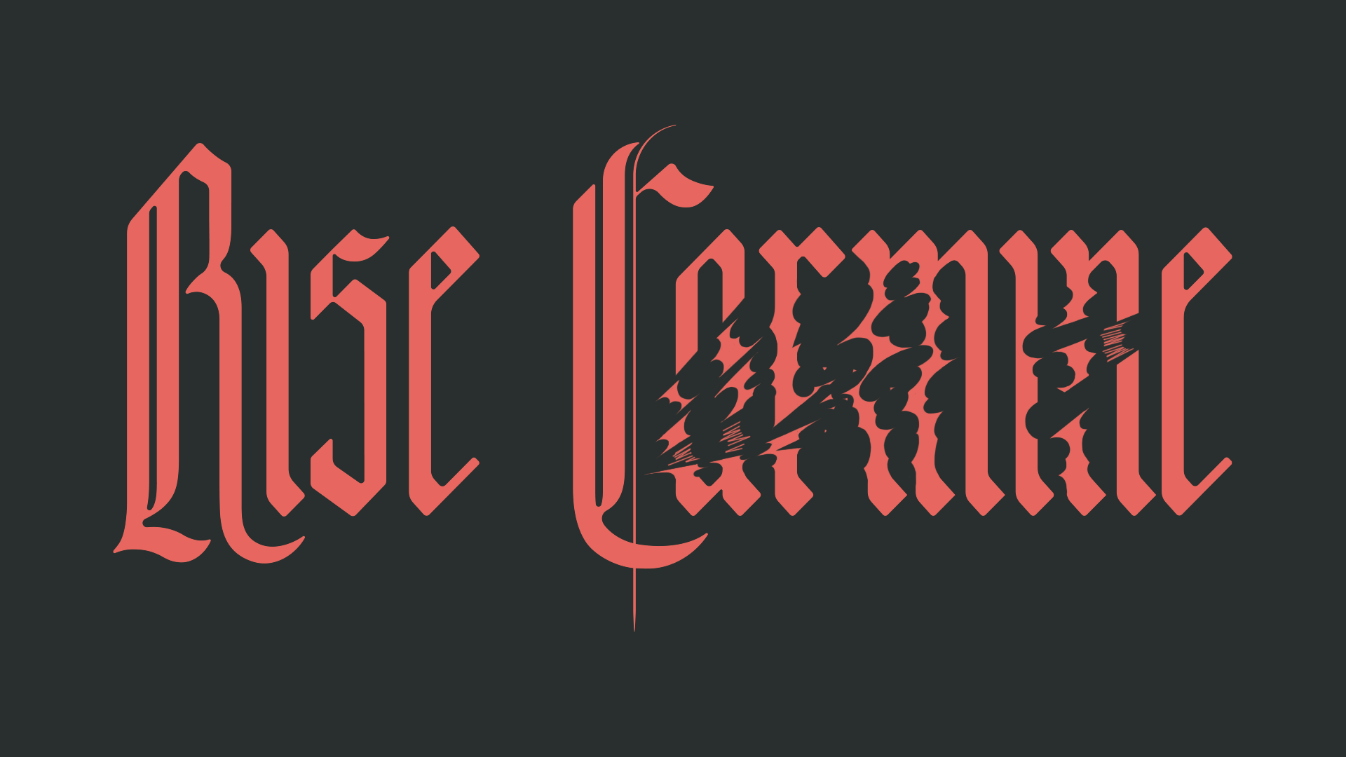
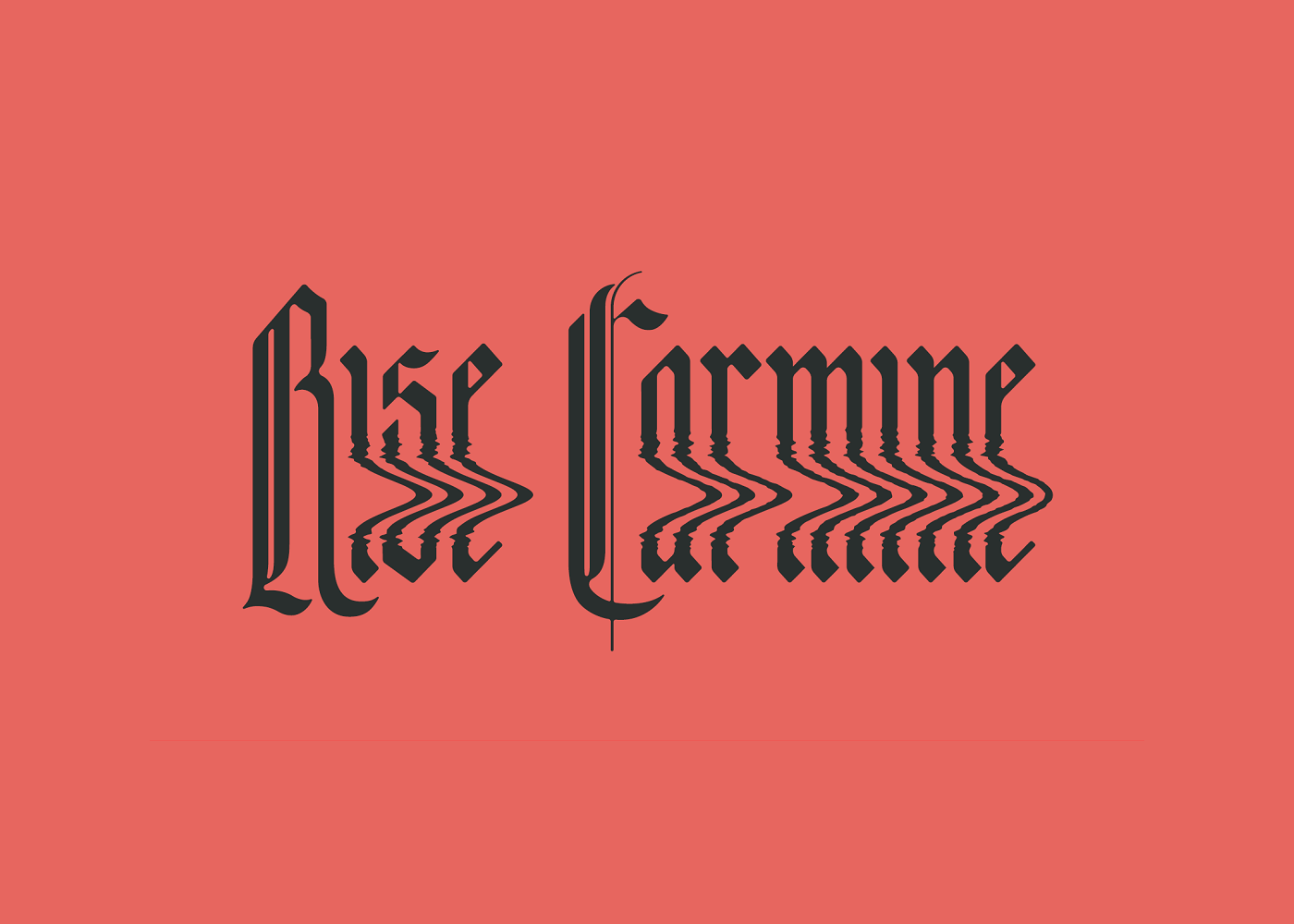
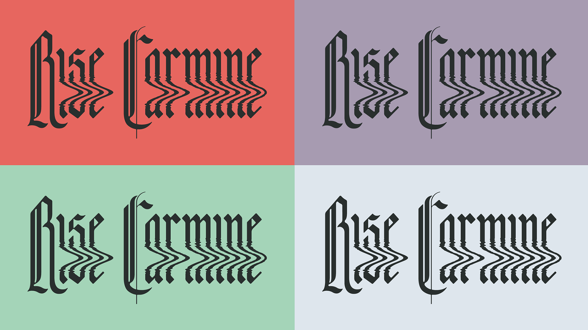
This redesign of Rise Carmine’s logo aimed to merge the band’s love for vintage horror movie poster aesthetics with an alternative rock vibe.
My Role
Typography, Logo Design, Handlettering
Process
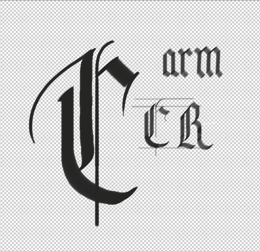
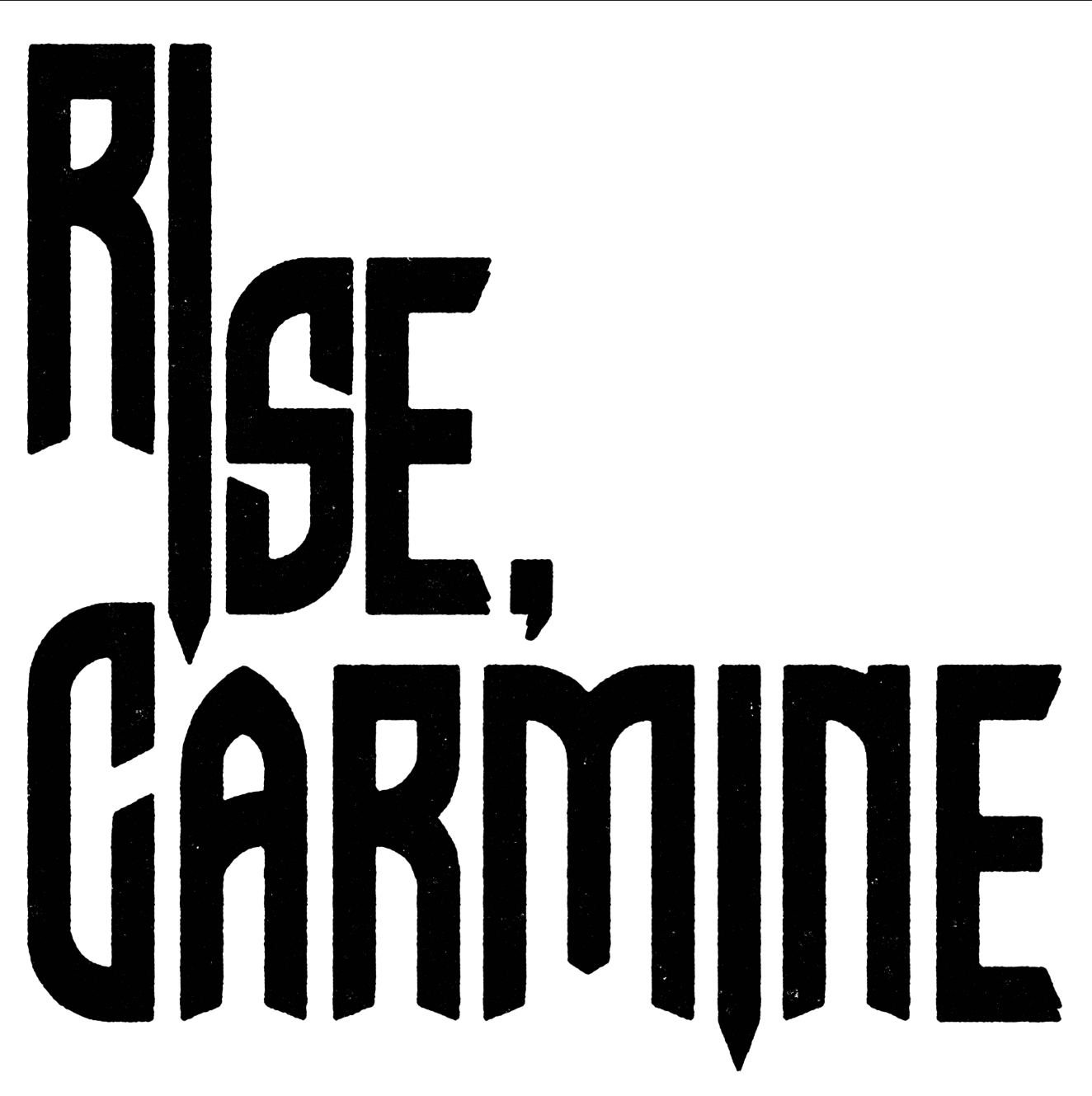
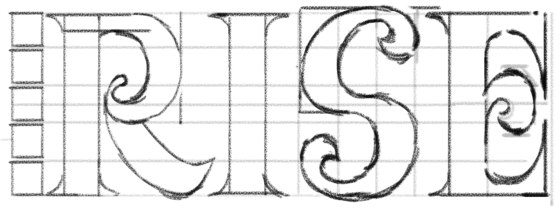
In this project I started with hand drawn sketches of possible directions for the logo. I provided the client with 3 different directions. One was a more cyber hacker digital look, one was inspired by the 60s Dune book covers and one was a hand drawn gothic blackletter look.
The client settled on the blackletter logo and so we went on to refine that. I vectorized the type and made it more uniform between letterforms in illustrator.
I used photoshop to manipulate the shape of the letters to add a rippling distortion effect. I wanted the distortion to add some visual interest yet not obscure the type so some changes had to made to accommodate. This involved stretching the text to make room for the distorted elements.
